
Brand Strategy Overview
Shoreline Sweets
PROJECT OVERVIEW
Shoreline Sweets is a mobile treat truck cruising along the picturesque shores of Lake Michigan, offering a delightful array of frozen treats to beachgoers and summer visitors. The menu features a variety of handcrafted ice creams, refreshing sorbets, and decadent frozen desserts, all made with the finest ingredients to ensure a burst of flavor in every bite. Whether you are enjoying a sunny day at the beach or taking a leisurely stroll along the shoreline, Shoreline Sweets is here to add a touch of sweetness to your summer experience.
Visual Identity
BRAND SUBSTANCE
Mission: To bring a touch of sweetness to beachgoers with handcrafted ice creams and refreshing frozen desserts that celebrate the flavors of summer on Lake Michigan.
AUDIENCE
Our target audience persona is Alex, a beach-loving, family-oriented individual who values quality and experiences. Alex seeks fun, memorable moments with friends and family and loves indulging in unique treats that elevate their time at the beach.
POSITIONING
Shoreline Sweets stands out with its premium, handcrafted treats that bring the essence of a lakeside summer to life, offering high-quality flavors that are as vibrant as the Grand Haven shoreline.
PERSONALITY
This brand embodies a playful and inviting personality that’s friendly, approachable, and full of joy. Its key traits are fun-loving, fresh, and delightfully laid-back, evoking the carefree feeling of summer by the lake.
.png)
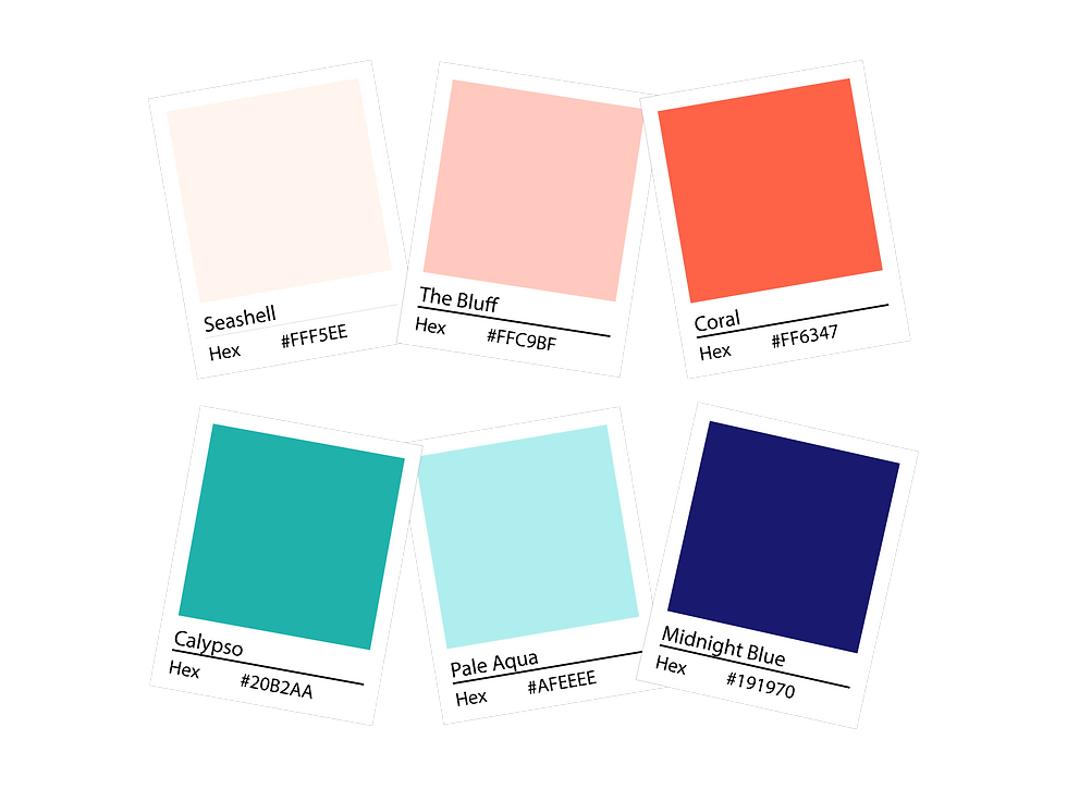
SUPPORTING ELEMENTS
The supporting elements of the Shoreline Sweets design include a beach-inspired color palette with shades of warm coral and soft peach, balanced by refreshing aqua tones and grounded with deep navy.
Iconography reinforces the brand’s playful vibe, featuring an ice cream cone topped with a swirl, an "S" adorned with a kite surfing sail, and the distinctive kiteboard motif. An alternating pattern of the kiteboard and ice cream cone enclosed in scalloped circles adds a whimsical, cohesive touch that ties together the brand's beachy, lakeside personality.
.png)


.png)
LOGO DESIGN
The logo sounds both distinctive and thoughtfully crafted, perfectly capturing Shoreline Sweets' connection to Lake Michigan. Its rounded, friendly font and subtle beach elements like the kiteboard-inspired "L" and wave-like "e" tail give it a playful, welcoming vibe, while the sandy curve anchors it in the lakeside experience. This design truly brings the brand's beachside, adventurous spirit to life!


.png)
.png)
.png)