
Brand Strategy Overview
Offsides Coffee Co.
PROJECT OVERVIEW
Offsides Coffee Co. isn’t your typical coffee brand, and that’s exactly how we like it. Born from a deep love of quality beans and community connection, Offsides needed a visual identity that captured the calm confidence of a well-brewed cup without leaning on tired clichés or overused trends. This wasn’t about being sporty, cheeky, or overly artisanal for the sake of it. It was about crafting a brand that felt serious about ingredients, intentional about experience, and quietly powerful in its presence, all from the side of a mobile coffee truck. We built a brand that invites curiosity, rewards quality, and sets the tone for the premium café experience that’s brewing ahead.
Visual Identity
BRAND SUBSTANCE
Mission: To serve thoughtfully sourced coffee with care, consistency, and craft, creating a mobile café experience that feels grounded, intentional, and quietly exceptional.
AUDIENCE
Taylor is a quality-obsessed coffee drinker who can taste the difference between a generic roast and a locally sourced bean. They care about ingredients, crave simplicity, and choose spaces that feel like a break from the noise whether they’re grabbing a quick espresso or lingering over a pour-over in the park. Offsides also connects with casual passersby who are drawn in by the clean, eye-catching truck and leave surprised by the depth of flavor and the warmth of the service. These are people who appreciate the little details such as homemade syrups, organic teas, fast lines, and a brand that feels like it was built for them.
POSITIONING
Offsides Coffee Co. positions itself as a mobile specialty coffee experience that delivers café-level quality without the pretension. With a focus on ethically sourced beans, housemade ingredients, and owner-led service, the brand stands out in a sea of overdesigned, underwhelming competitors. The wing-inspired brandmark speaks to movement, curiosity, and quality in motion inviting coffee lovers to slow down, savor the experience, and discover something distinctly better than what they expected from a truck.
PERSONALITY
The brand is grounded, calm, and deeply intentional, with a quiet confidence that doesn't need to shout to be seen. The tone is warm, professional and serious about quality, but never unapproachable. It’s artisan-forward without feeling precious, designed for connection without the gimmicks. It speaks to people who value integrity, craft, and a little bit of magic in their daily rituals.

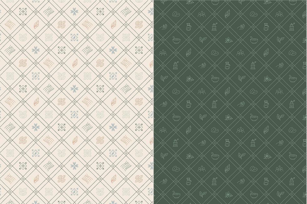
SUPPORTING ELEMENTS
Beyond the logo, we developed a full brand aesthetic that reflects Offsides’ artisan roots from color choices that feel grounded and organic, to typographic details that lean modern but human. The visual language is designed to evoke calm curiosity, whether you’re approaching the truck, scrolling the menu, or holding one of their custom cups. Each detail is crafted to reflect the heart of the brand: quality over flash, experience over trends, and coffee that feels personal from the first pour.


LOGO DESIGN
The final logo suite for Offsides Coffee Co. blends clean typography with a semi-abstract brandmark inspired by grasshopper wing vein structures, which is a nod to movement, transformation, and natural design. The badge logo frames the brand in an arched shape, creating a balanced visual identity that works seamlessly across packaging, signage, and the truck exterior. Every element was created to feel timeless, intentional, and elevated which is the kind of design that builds trust at first glance and stays memorable after the last sip.


