
Brand Strategy Overview
Hasley Wren
PROJECT OVERVIEW
Our project focuses on creating a cohesive brand identity that reflects Hasley Wren Photography’s commitment to capturing authentic, heartfelt moments, both in the studio and on location.
Visual Identity
BRAND SUBSTANCE
Mission: To capture cherished memories with authenticity and artistry, creating lasting images that resonate with emotion and meaning.
AUDIENCE
Our target persona is Megan, a parent and professional seeking a photographer who balances technical skill with a warm, personal approach, capturing life’s important moments with authenticity.
POSITIONING
Hasley Wren Photography stands out by providing an approachable, artistic photography experience that meets clients where they are, whether in the studio or out in nature.
PERSONALITY
The brand personality is warm, artistic, and empathetic, blending professionalism with a down-to-earth style to make clients feel comfortable and valued.

SUPPORTING ELEMENTS
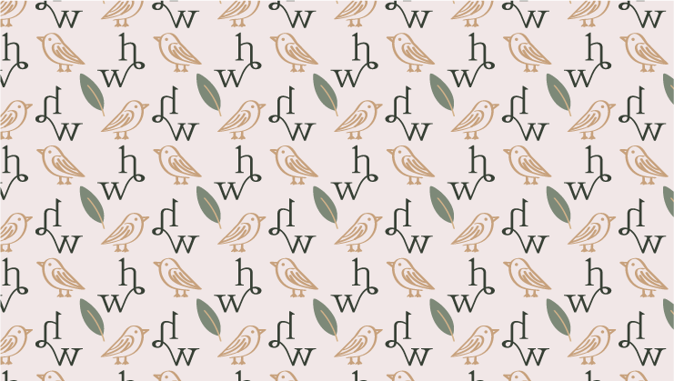
The color palette of this design brings warmth and a natural, earthy feel, creating a grounded, organic vibe that complements the brand's focus on authentic moments.
The hand-drawn leaf and wren bird add a touch of artistry and storytelling, symbolizing growth, connection, and the beauty of nature.
The subtle "hw" pattern reinforces brand recognition and creates a cohesive visual texture, tying together the elements in a refined, memorable way.

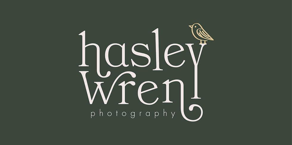
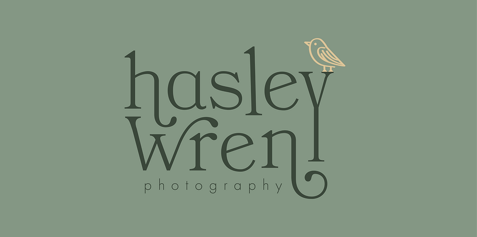

LOGO DESIGN
The wren bird icon ties directly to the client’s name, setting the logo apart from typical photography brands and symbolizing creativity and storytelling—a perfect fit for Hasley Wren’s mission to capture deeply personal moments.
The elegant serif font choice brings a timeless, professional feel, reflecting the brand’s commitment to high-quality, enduring images. The font’s elongated, swooping lines add a touch of natural charm and provide the perfect perch for the wren, balancing the logo with a fun, approachable vibe.


